MGE Viper: Another Xtreme Gamer Creation
by Purav Sanghani on December 18, 2004 5:14 PM EST- Posted in
- Cases/Cooling/PSUs
Internal Design
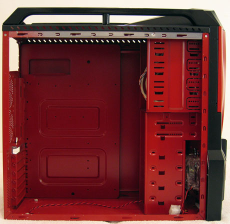
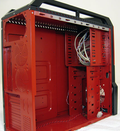
As we opened up the Viper, we were quickly blasted back to our look at the Sidewinder in mid-October. The Viper has the same internals as the Sidewinder in every aspect except the red paintjob (matching paint to the external shell), and we can, therefore, safely assume that they are both based on the same model.The internal structure includes drive bay mounts, which compose the entire front 1/3 of the chassis. There are a total of four 5-1/4" drive bays and six 3-1/2" drive bays, two of those being external for applications such as floppy drives, flash card readers, etc.
Also, just like the Sidewinder, the Viper has no tool-less features for its drive bays. Being a gaming chassis, we would expect MGE to implement even the simplest type of tool-less device. At the least, we would have liked to see thumbscrews for securing the side panels if not the drive bays.
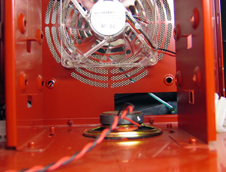
One thing that worried us was the placement of the case's PC speaker at the bottom of the case, vertically in line with the drive bays. This puts the magnet bearing speaker about 3/4" below the bottom-most HDD, which could lead to data corruption. We recommend that either users remove this speaker or MGE change their design and move it to an area away from the drive bays.
The Viper does have plenty of space to work with. Besides the space to add up to six 3-1/2" drives and four 5-1/4" drives, there is plenty of clearance between the motherboard tray and the drive bays, 2-1/2" to be exact.
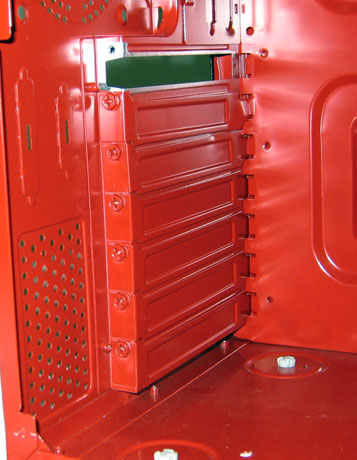
The expansion slots also lack tool-less features. MGE has kept the traditional Philips head mounting screw method to secure add-on cards to the Viper.


41 Comments
View All Comments
Aquila76 - Sunday, December 19, 2004 - link
AnadTech's case review team - Here is what 99% of your readers look for when buying a case:Subtlety
Great Cooling
Subtlety
Internal features
Subtlety
Room for expansion
Subtlety
Did my semi-sublimnal hints get the point across?
for an example of just such a case, which I received and setup last week, look here:
http://www.newegg.com/app/ViewProductDesc.asp?desc...
mrdudesir - Sunday, December 19, 2004 - link
im glad i read these comments and found more people like me who are sick of the overblown "modded" cases flooding the market now. I just want something slick, classy, and unobtrusive (why i love my antec sonata so much). Not to mention from my experience these premod cases are loud as hell and cheaply constructed.Poser - Sunday, December 19, 2004 - link
I was a little surprised to see the comment about the internal speaker being worrysome. See the question, "The enemy within?" here for why:http://www.dansdata.com/io014.htm
TinyTeeth - Sunday, December 19, 2004 - link
Oh yeah, by the way, sorry for the double post but, is Anandtech going to review the Dragon? That case seems quite a lot more interesting.TinyTeeth - Sunday, December 19, 2004 - link
Sure, it looks a bit cool, but it ain't anything I'd like on my desk. This is something you show off at LAN parties, not using every day.Besides, the front looks plastic and a bit like it was built in LEGO.
MemberSince97 - Sunday, December 19, 2004 - link
The upcomoming Dragon looks acceptable...kmmatney - Sunday, December 19, 2004 - link
The blue version of this case looks better than the red, IMO. Microcenter has it advertised with a 500 Watt PSU, but I think it needs to be cheaper than $99 if it going to sell.Panther - Sunday, December 19, 2004 - link
is there a shortage of legitimate hardware to review around the labs?istari101 - Saturday, December 18, 2004 - link
I like the simplistic, clean style of a coolermaster case. Specifically the Praetorian, but those gaudy plastic facings of the reviewed case is definitely not my thing. Neon lighting in cases is distracting for me.Bonesdad - Saturday, December 18, 2004 - link
cmon, lets do some reviews on REAL cases. Gawd, this has to be the one of the fugliest things evar.