Aspire X-QPack: A Lanparty Dream
by Joshua Buss on July 2, 2005 1:15 PM EST- Posted in
- Cases/Cooling/PSUs
External Design
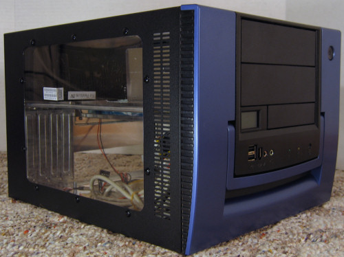
From a styling perspective, the X-QPack manages to find a nice compromise between 'extreme' and 'professional' through the use of classy, straightforward lines on the front of the case and a triple-window removable piece.
Click to Enlarge
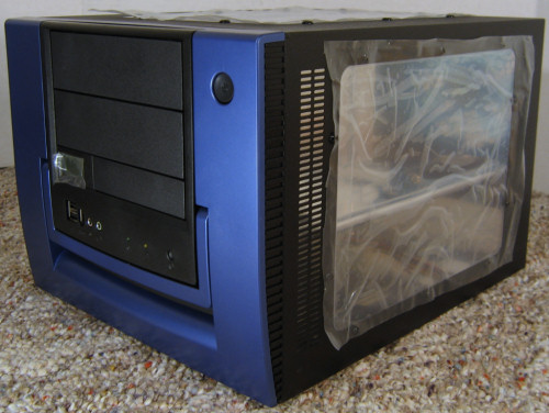
Aspire ships the case with plenty of protection for all this plexiglas - there's covering on the inside and outside of all three windows and also a small piece covering the LCD display on the front.
Click to Enlarge
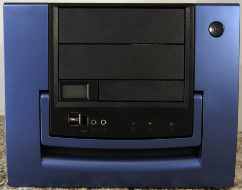
Looking at the front in more detail we can clearly see the carrying handle as well as the LCD readout display, USB 2.0 / Firewire / audio ports, power LED, HDD activity LED, reset and power buttons. Our only complaint with the layout here is that the Firewire port might be difficult to use if you have a larger usb device plugged in at the time, but this is a rather common problem when it comes to front port-clusters.
Click to Enlarge
Another quick glance confirms the unit's claim to being able to fully support two external 5.25" drives and one external 3.5" drive. Only a very few other cases this compact have the ability to hold two 5.25" drives, and this is one of the first areas where the X-QPack begins to strut its stuff. Speaking of size, the chassis is definitely in a class all its own. It's larger than pretty much any shuttle XPC in both width and height, but not by much - certainly not enough to be looked over in situations where an XPC might be considered. It is primarily this unique size of the X-QPack that allows it to get so many things right.
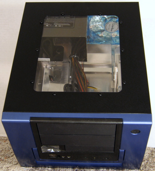
Here is an angled shot of the third window, the one on top of the case. Here we can start to get a better idea of how the case's internals are laid out.
Click to Enlarge
It's not too easy to tell from the pictures, but the front of the case is a rather normal plastic whereas the sides are a textured metal that resists fingerprints quite nicely. In spite of all the glory that super-gloss, car-paint style jobs get, there sure is something to be said for a case that does not need to be kept immaculate to look good.
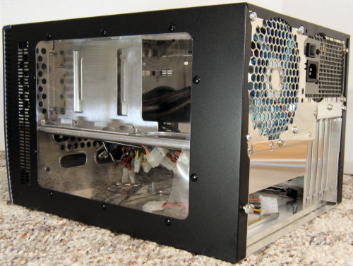
Here we can see the right side of the case again as well as the back of the unit.
Click to Enlarge
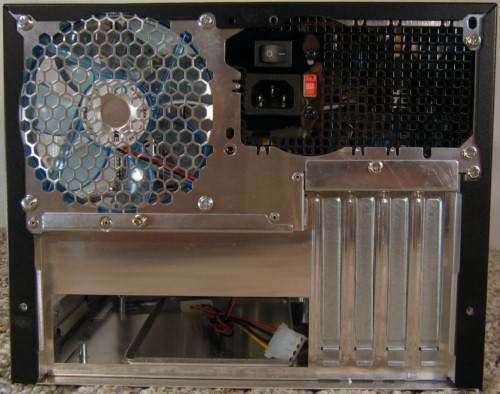
The HD cage as well as the beam that supports it is visible through the window, and looking at the back we can see the nice large 120mm exhaust fan as well as the motherboard tray. Here's another shot of just the back, with the three thumbscrews that hold the top/side panel cover all removed.
Click to Enlarge
Now we can clearly see just how carefully the layout of the back of the unit has been planned. The 120mm fan fits with just enough room underneath to make the removable tray a possibility, and while the included power supply does not have the same depth as a standard ATX one, it does have the same height and width. We can also see one of the main benefits of choosing a full-fledged micro-ATX board over smaller alternatives: four PCI slots.
Click to Enlarge
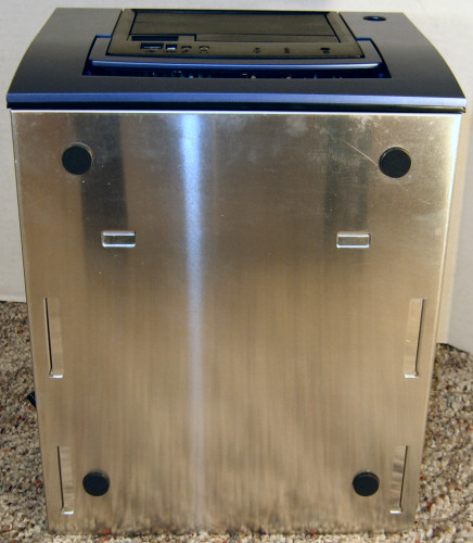
Looking at the bottom of the case we find that the X-QPack uses four dark gray rubber feet to keep the unit from sliding on any surface. Let's pop the hood and take a look at what's underneath.


66 Comments
View All Comments
Pannenkoek - Saturday, July 2, 2005 - link
[OT] Can anyone from Anandtech explain what happened to both the game console performance speculation article and Anand's blog entry on the same subject? Called by a lawyer?Sunbird - Saturday, July 2, 2005 - link
I would really love a SFF case that is just plain black, but with a nice handle on top to carry it with.... then I'd just need a monitor with a handle too!Cookie Crusher - Saturday, July 2, 2005 - link
The nice thing about the case is the little bit of extra room it provides. It could really be a case modders dream in the sense that a water cooling system is possible. I think it's probably a worthwhile tradeoff that this case is slightly larger than a traditional SFF case like a shuttle. Nice review, I'll be taking a closer look at this case because of it.Tamale - Saturday, July 2, 2005 - link
yeah getting this review online was a little bit messy.. haha.. I think it's ok nowand I have to agree with you guys.. this little thing is sweet
hoppa - Saturday, July 2, 2005 - link
Ah, finally, a review of a nice-looking case on AT. And, I must admit, a very, *very* nice case at that. Long gone are the days of the 102 dB "2XTREME SPIDER ILLUMOCHASSIS ZINC-COBALT FUSION SUPERDESTRUCTO CASE FORM HELL"Joshua, the image for the sound benchmark is blank.
-andy
Rapsven - Saturday, July 2, 2005 - link
Seems like a good buy.